Color theory
To practice the application of color theory, I decided to get back into art, as it’s something I’ve been meaning to do for quite a while now. So I opened my drawing program, Krita, to start working, and decided to draw a knight heading into battle ready to defent a castle, with a red vignette, to represent danger, and a blue color scheme around to knight to both contrast the red environment and to represent a feeling of safety and security.
However, this ended up not satiftfying me, as from a political angle, the colors implied an opposition to my personal politics, and the drawing itself was a depiction of a defense of monarchy, something I myself wholly disagree with.
Instead of this, I wanted something to represent either a more personal experience or feeling, or something with a more leftist political message. Upon reconsidering, I could choose between two different designs, one simplistic one, with a fist or hand rising up, surrounded by a red and white aura, contrasting a darkblue and purple vignette, the other a far away self portrait, featuring lots of black and red, with perhaps some teal surrounded by white contrasting this dark environment.
Logo Design
Soup logo
For our first logo design assignment, we were instructed to work on logos for brands we made up, so my project group and I decided to work together on brainstorming a logo for a soup brand, by incorporating the shape of soup containers, elements of soup, and utensils like spoons, which lead us to many different designs, although it would also be wise to also consider emotional aspects. Not so much the physics or properties of soup, but the context and feeling of enjoying a nice warm soup.
Personal logos
After this, I started looking into my own logo a second time. While the original logo I made looks clean and good, it lacks a personal touch. The logo itself being heavily inspired by one of artist Rina Sawayamas logos, there’s not much in the way of it saying anything about me, so I continued to experiment with what my logo could involve and look like.
Eventually, i came to realize that a simple C with a curve on top is a very good logo, as it has both the symbolism from my own life i want in it, and it is simplistic, which makes for a very recognizable, yet compact image. I want to use this as my main logo, but i also want to keep using the wider one for wider areas where the taller logo wouldn't fit as well.
Typography
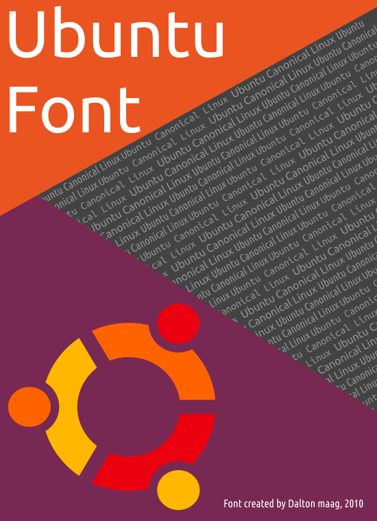
As practice for typography we were tasked with researching a font, and then making a poster about that font. I worked together with Chad, and we originally wanted to make a poster about the Unown Pokemon, as this Pokemon is actually a font in itself, However, it was not possible to find a functinal usable font for this, so instead we decided to make a poster for the Ubuntu font.
The Ubuntu typeface was developed specifically for use in the Linux based Ubuntu operating system developed by Canonical, and the font was comissioned to Dalton Maag, a font foundry located in London, in 2010. Therefore, the poster I created features the logo for Ubuntu, the color palette for the OS, and in the background a showcase of the three different types of fonts, which ended up as this poster.